
Chromaticity Diagrams
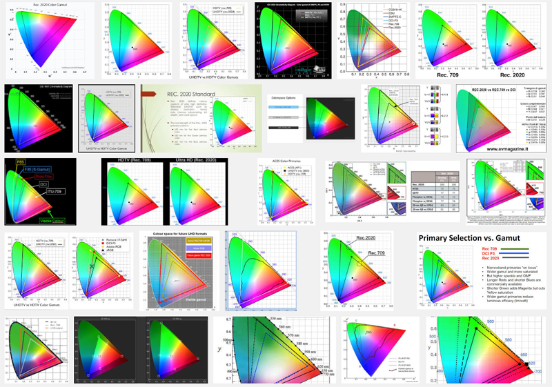
Searching the Internet for images with the keyword Rec2020
delivers results like the one depicted above. In a sample of 30 results only 2 use the u',v' diagram to show the new color space for ultra-high definition television systems. All others use the x,y chromaticity diagram.
The fact that, on the x,y chromaticity diagram, colours are represented with very large departures from uniform spacing has been known now for at least 60 years ... and it was 34 years ago, in 1976, that the CIE made available the much more uniform u',v' chromaticity diagram
said and wrote Robert W.G. Hunt in 2010. He aptly titled his keynote The Challenge of our Unknown Knowns
.
The intend of most of the diagrams is to compare the gamut of ITU-R BT2020 with the gamut of ITU-R BT709 or with other color gamuts like the digital cinema gamut. Hunt continues to say that the very purpose of plotting chromaticities on a diagram is to be able to draw conclusions about the relevance of their positions. As far as gamuts are concerned, as has already been shown, the use of the x,y chromaticity diagram results in false conclusions being drawn.
What does it mean to say that the x,y chromaticity diagram represents colors with very large departures from uniform spacing? I can't show color differences between Rec709 and Rec2020 gamut because I have to assume that your monitor is sRGB, which has the same gamut as Rec709. Instead, let's look at examples within the Rec709 gamut.
On the left-hand side you see three pairs of colors. How do you judge the differences between the colors in each pair? All observers I asked agree on the order. The difference between the two blueish colors is the largest. They have quite different hues and are not similar at all. The difference between the two green colors is smaller than the difference between the red colors. So, we have ΔB > ΔR > ΔG, agreed? In the x,y chromaticity diagram, however, the distance between the red colors, between the green colors, and between the blueish colors is the same.
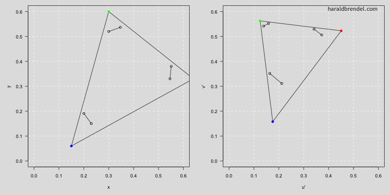
The u',v' diagram is a projective transformation of the x,y chromaticity diagram designed for a more uniform representation of perceived color differences. It's not really uniform but much better. In the UCS diagram the geometric distances are approximately proportional to our perceived color differences.
Looking at the gamuts of Rec709 and Rec2020 in the x,y diagram you might think the difference is mostly in the green region. The UCS diagram shows a more realistic picture. The red of Rec2020 is really popping. Even though the extension of the primary colors is largest in red and green, the new color space extends much more into the cyan and magenta region than into the yellow region.
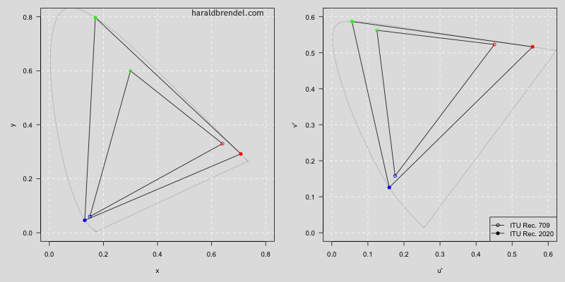
Let's remember our unknown knowns
and use the CIE 1976 u',v' diagram to compare color gamuts. Let's also remember that a comparison of chromaticities (no matter in which diagram) is useful only if the brightness and contrast of two displays is the same.